Carat premium curves: where the 2026 price steps actually sit
Live platform data shows where the 2026 carat premium steps actually sit — and the price curve for round brilliants is not where last year's sheets put it.
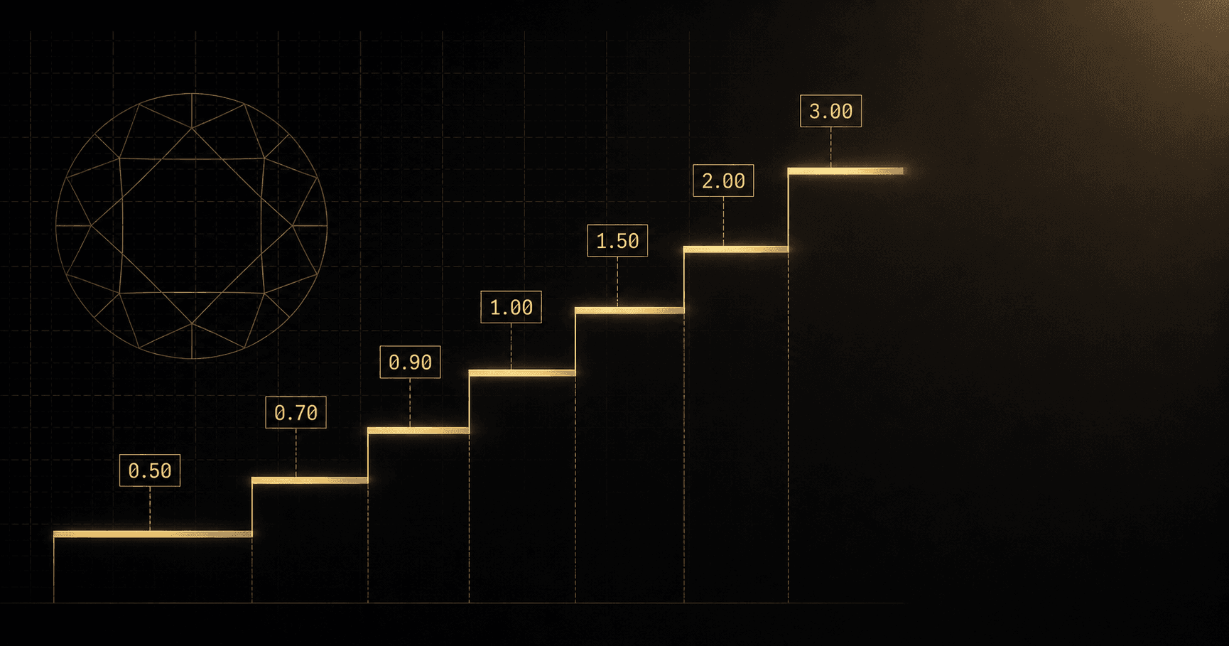
The textbook diamond carat premium is drawn as a smooth curve. Live market data in 2026 says it is more like a staircase, with the risers sitting at slightly different heights than the price sheets that were sourcing last quarter's quotes. This is what the curve actually looks like right now, weight bucket by weight bucket.
Today's snapshot
April 2026 Overview
Updated May 1, 2026The figures above are the platform's full-market view across every spec the data covers. The carat-curve question lives one level down — inside specific colour and clarity bands, the price per carat jumps in steps as weight crosses each threshold. The aggregates wash that out; the segmented view is where the premium becomes legible.
For this post the comparable set is held still: round brilliant, G VS1, Excellent cut on GIA paper, snapshot taken late April 2026. Fixing the other parameters is the only way to read the carat premium cleanly — letting colour or clarity drift across the buckets blends two effects into one number that describes neither.
The curve, bucket by bucket
The standard observation: price per carat rises as weight grows. The non-standard observation in 2026 is that the step size is not uniform, and the order of which steps are largest has shifted. For the G VS1 EX round brilliant comparable, the platform-observed step pattern reads roughly as follows on a per-carat basis (not absolute dollars):
0.30–0.49ct→0.50–0.69ct: 8–12% lift, anchored by retail entry-tier visibility at the half-carat line0.50–0.69ct→0.70–0.89ct: 10–15% lift, skewing higher in markets where0.70ctis the lighter retail anchor0.70–0.89ct→0.90–0.99ct: 5–8% lift only — the band immediately under one carat sits in a buyer pool that already knows it is below the threshold0.90–0.99ct→1.00–1.49ct: 18–24% lift — the dominant step on the curve, holding firm against repeated calls that it would compress1.00–1.49ct→1.50–1.99ct: 12–18% lift, with a sharper sub-step at the1.50ctboundary itself1.50–1.99ct→2.00–2.99ct: 14–20% lift — unusually wide for 2026 versus 2024 readings of the same comparable2.00–2.99ct→3.00ct+: 10–15% per-carat lift, plus an additional bucket-shift premium because investment-tier buyers enter the comparable set
Stack the per-carat steps with the bucket weight itself and the absolute price gap between, say, a 0.95ct and a 1.05ct of the same colour and clarity runs closer to 25–32% in dollar terms — the figure a sourcing manager actually feels at the cheque. The percentage and the dollar gap are different conversations; conflating them is one of the cleanest ways to misquote near a threshold.
Where the 2026 carat premium curve breaks from textbook
Two readings on the curve pull away from the standard pattern. The first is the 2.00ct step. Last year's price sheets sized this jump at roughly 10% per carat above the 1.50–1.99ct band; the 2026 platform reading puts it closer to 15%, and the spread inside the 2.00–2.99ct bucket has tightened — buyers in that band are paying for the round-number positioning more firmly than they were a year ago. The likely reason is straightforward. Investment-tier buyers sitting out the lab-grown compression in lower bands have anchored harder on 2.00ct+ natural as the uncontested zone, and the demand pull at that boundary has stiffened the price step.
The second divergence is at the lower end. The 0.30 → 0.50 step has flattened versus 2023 readings, where the half-carat threshold used to print a clearer 12–15% jump on the per-carat figure. Lab-grown competition has compressed pricing across the smaller-stone band hard enough that the natural-only curve in 0.30–0.69ct reads as gentler than the textbook curve a price sheet from two years ago would describe. The lesson is not that the half-carat line stopped mattering — it is that the band itself has been re-priced as a category, and the threshold premium reads softer because the surrounding buckets moved with it.
Pricing the curve, not the line
Weight ratio: 2.00×· Diameter ratio: 1.26×
Diameters use the industry approximation d ≈ 6.5 × ∛(ct) for a well-proportioned round brilliant. Actual cut geometry can shift face-up diameter by a few tenths of a millimetre.
The visual is the part the spreadsheet does not capture. A 1.00ct is barely larger than a 0.90ct face-up, and a 2.00ct is only ~26% wider in diameter than a 1.00ct. The price curve does not care. It is a buyer-pool curve, not a measuring-stick curve, and the steps live where the buyer pools change — not where the diameter changes.
The actionable read for sourcing or pricing is to drop the smooth-curve mental model. Quote each weight bucket against its own comparable set, identify the step the stone sits next to, and decide whether the stone is inside the threshold or below it. A 0.99ct priced off a 1.00–1.09ct comp is mispriced by the size of the threshold step; a 1.05ct priced off a 0.95–1.05ct averaged set is mispriced by the same amount in the other direction. The averaging is where the money leaks.
For the threshold-by-threshold detail on why these steps exist and where the magic sizes sit on the ladder, The 0.99 vs 1.00ct jump: why magic carat sizes still print money walks through the rough-yield and bridal-anchor mechanics. For the underlying weight-to-diameter geometry, Carat covers the math. The curve will keep moving — the bucket-by-bucket reading is what stays usable as it does.